Appearance and Transition
Related Configuration Options
| Property Name | Description | Type | Default Value |
|---|---|---|---|
| disableTransition | Disable transition effects | boolean | false |
| themeName | Theme name | string | - |
| customStyle | Custom styles | object | - |
disableTransition
In this version, we have added many transition effects, such as when the plugin is shown or hidden, when switching thumbnails, and when switching large images. These effects provide a good visual experience, making everything less abrupt. However, some users may want to disable transition effects due to device performance issues or a large number of images. Therefore, we provide the disableTransition configuration option. Simply set it to true to disable global transition effects.
themeName
The liquid glass effect in iOS 26 inspired us to bring this new UI style to the plugin. However, due to front-end technology limitations, the effect is far from the one in iOS. Additionally, we considered that not all users might like this style, so we made it into a theme named glass-theme. If you need it, simply pass it as a parameter to the themeName configuration option. If needed, we will create more themes for you to choose from in the future.
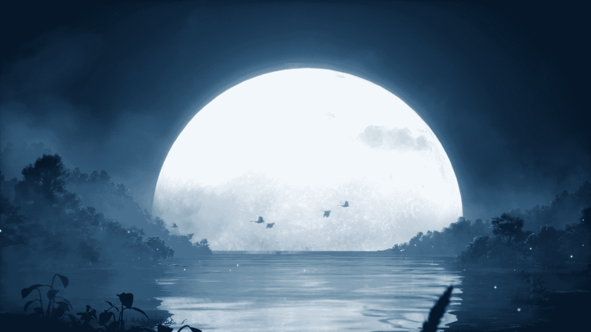
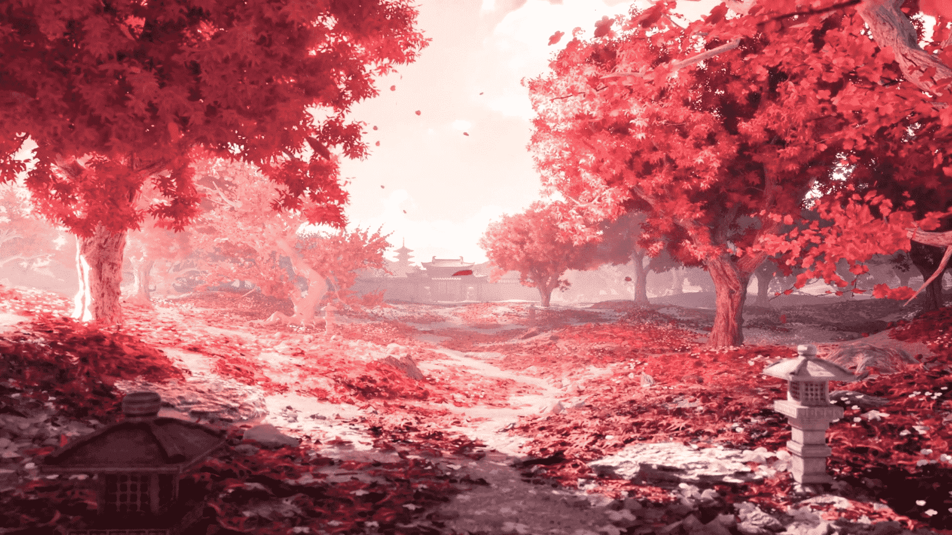
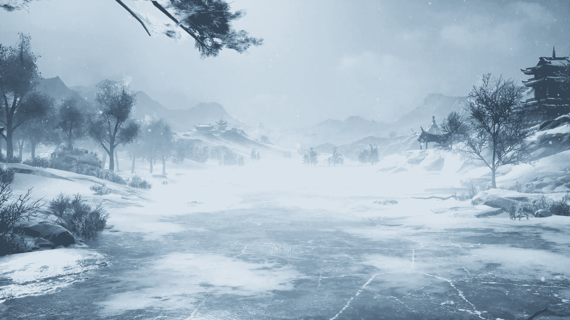
Click the image below to experience it now~

Note
Since filters and transition effects cannot coexist, you will notice that the filter suddenly appears after the transition effect ends. The author has not solved this issue yet, so you may consider whether to use this theme. If you decide to use it, we recommend disabling global transition effects while using this theme.
customStyle
Although we have tried to provide the best-looking default styles, they may still not match your website's style. Therefore, we offer some customization options for styles. If the following configurations still cannot meet your needs, you can also use the console to get the class names of the parts you want to modify and override them with custom CSS styles.
For custom styles, we use CSS variables, so the field names follow CSS variable conventions. We provide general main variables to control global styles. If you want to modify the overall background color, text color, etc., modifying the general main variables will be more convenient. If you want to make individual style adjustments to a specific part of the plugin, we also provide separate configuration options for them.
Usage
this.$hevueImgPreview({
  // Other parameters
  customStyle: {
    '--hevueimg-main-bg-color': 'rgba(255, 255, 255, 0.5)', // Change global background main color to semi-transparent white
    '--hevueimg-close-icon-text-color': 'blue' // Change close button icon color to blue
  }
})
🎨 General Main Variables
| Field Name | Default Value | Description |
|---|---|---|
| --hevueimg-main-bg-color | rgba(0, 0, 0, 0.3) | Background color |
| --hevueimg-main-text-color | rgba(255, 255, 255, 0.7) | Text color |
| --hevueimg-main-backdrop | blur(5px) | Background filter |
| --hevueimg-main-border | none | Border style |
| --hevueimg-main-box-shadow | none | Shadow effect |
🛡 Mask
| Field Name | Default Value | Description |
|---|---|---|
| --hevueimg-mask-bg-color | var(--hevueimg-main-bg-color) | Background color |
| --hevueimg-mask-backdrop | var(--hevueimg-main-backdrop) | Background filter |
🧭 Top-right Close Button
| Field Name | Default Value | Description |
|---|---|---|
| --hevueimg-close-bg-color | var(--hevueimg-main-bg-color) | Background color |
| --hevueimg-close-backdrop | var(--hevueimg-main-backdrop) | Background filter |
| --hevueimg-close-border | var(--hevueimg-main-border) | Border style |
| --hevueimg-close-box-shadow | var(--hevueimg-main-box-shadow) | Shadow effect |
| --hevueimg-close-icon-text-color | var(--hevueimg-main-text-color) | Icon/Text color |
⬅️➡️ Side Arrows
| Field Name | Default Value | Description |
|---|---|---|
| --hevueimg-arrow-bg-color | var(--hevueimg-main-bg-color) | Background color |
| --hevueimg-arrow-backdrop | var(--hevueimg-main-backdrop) | Background filter |
| --hevueimg-arrow-border | var(--hevueimg-main-border) | Border style |
| --hevueimg-arrow-box-shadow | var(--hevueimg-main-box-shadow) | Shadow effect |
| --hevueimg-arrow-text-color | var(--hevueimg-main-text-color) | Text/Icon color |
⚙️ Control Bar
| Field Name | Default Value | Description |
|---|---|---|
| --hevueimg-controlbar-bg-color | var(--hevueimg-main-bg-color) | Background color |
| --hevueimg-controlbar-backdrop | var(--hevueimg-main-backdrop) | Background filter |
| --hevueimg-controlbar-border | var(--hevueimg-main-border) | Border style |
| --hevueimg-controlbar-box-shadow | var(--hevueimg-main-box-shadow) | Shadow effect |
| --hevueimg-controlbar-text-color | var(--hevueimg-main-text-color) | Text color |
🔢 Bottom Image Counter
| Field Name | Default Value | Description |
|---|---|---|
| --hevueimg-controlnum-bg-color | var(--hevueimg-main-bg-color) | Background color |
| --hevueimg-controlnum-backdrop | var(--hevueimg-main-backdrop) | Background filter |
| --hevueimg-controlnum-border | var(--hevueimg-main-border) | Border style |
| --hevueimg-controlnum-box-shadow | var(--hevueimg-main-box-shadow) | Shadow effect |
| --hevueimg-controlnum-text-color | var(--hevueimg-main-text-color) | Text color |
❓ Shortcut Help Popup
| Field Name | Default Value | Description |
|---|---|---|
| --hevueimg-help-bg-color | var(--hevueimg-main-bg-color) | Background color |
| --hevueimg-help-backdrop | var(--hevueimg-main-backdrop) | Background filter |
| --hevueimg-help-border | var(--hevueimg-main-border) | Border style |
| --hevueimg-help-box-shadow | var(--hevueimg-main-box-shadow) | Shadow effect |
| --hevueimg-help-text-color | var(--hevueimg-main-text-color) | Text color |
🔄 Custom Rotate Control Bar
| Field Name | Default Value | Description |
|---|---|---|
| --hevueimg-custom-rotate-bg-color | var(--hevueimg-main-bg-color) | Background color |
| --hevueimg-custom-rotate-backdrop | var(--hevueimg-main-backdrop) | Background filter |
| --hevueimg-custom-rotate-border | var(--hevueimg-main-border) | Border style |
| --hevueimg-custom-rotate-box-shadow | var(--hevueimg-main-box-shadow) | Shadow effect |
| --hevueimg-custom-rotate-text-color | var(--hevueimg-main-text-color) | Button text color |
🔄 Custom Rotate Angle Label
| Field Name | Default Value | Description |
|---|---|---|
| --hevueimg-custom-rotate-label-bg-color | var(--hevueimg-main-bg-color) | Background color |
| --hevueimg-custom-rotate-label-backdrop | var(--hevueimg-main-backdrop) | Background filter |
| --hevueimg-custom-rotate-label-border | var(--hevueimg-main-border) | Border style |
| --hevueimg-custom-rotate-label-box-shadow | var(--hevueimg-main-box-shadow) | Shadow effect |
| --hevueimg-custom-rotate-label-text-color | var(--hevueimg-main-text-color) | Text color |